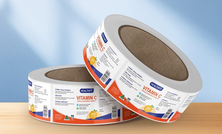
Your packaging looks great on screen. Then it meets a fridge, a warehouse trolley and a delivery van, and the artwork starts curling at one corner. Good label printing has to survive the journey, not just the mockup. Looking sharp is the easy part. Staying stuck, readable and clean is the real work.
The fix is not fancier artwork. It is matching the material and finish to whatever the product is about to go through. Smart label printing treats stock, laminate and adhesive as design decisions rather than afterthoughts, which is why two labels that look identical on shelf can behave completely differently once the product starts moving through storage and handling.
The Label Looked Perfect until It Met Real Life
Pretty Artwork Cannot Fix a Bad Material Match: A label fails when the material underneath it cannot handle the conditions the product lives in, no matter how good the design is. Condensation loosens edges. Oils darken uncoated stock. Repeated handling scuffs anything unlaminated. The artwork gets blamed, the material was the actual culprit, and the reprint bill arrives either way.


The Cost of Putting the Material Decision Off: Delaying the material decision narrows the options later, because artwork gets locked, sizes get signed off and reprints start costing more than the original run. Production teams routinely see brands that chose stock on price alone, then quietly replaced a full season of packaging after the first humid summer. Fixing it early is cheaper than fixing it twice.
Your Product’s Environment Has Opinions about Your Label
Cold, Damp and Oily Conditions Change the Rules: Refrigerated and chilled products put labels through repeated condensation cycles, which is where paper stock without the right adhesive starts lifting at the corners. Products moving through cold chain distribution face temperature swings between storage, transport and shelf, and every swing puts stress on the bond holding the label to the container.
Handling Is the Damage Nobody Plans for: Every time a product is picked up, restocked or wiped down, the label surface takes a small hit. Cosmetics get handled constantly in store. Sauce bottles get greasy fingers. Bakery packaging gets stacked and shuffled. A laminate is what stands between all of that and a label that still looks new at the checkout.
Paper, Synthetic or Silver, and when Each One Earns Its Place
Paper Stock Handles More than People Expect: Laminated paper stock suits dry goods, bakery items, confectionery and pantry products stored at room temperature, and it keeps costs sensible on shorter runs. Matte or gloss laminate gives it a clean finish and a layer of protection. Most food label printing projects start here for good reason, because the performance gap only opens up under moisture.
Synthetic and Silver Stocks Buy You Insurance: Synthetic polypropylene stock does not absorb water, so it holds up around refrigeration, sauces, dairy and oil-based contents where paper would struggle. Materials with low moisture vapour transmission keep the printed surface stable while conditions change around it. Synthetic silver stock adds a metallic look with the same practical resilience, which suits premium ranges that still get handled hard.
The Finish You Choose Is a Long Game
Uncoated Texture Trades Shine for Feel: Uncoated paper stock gives a textured, natural finish that suits preserves, sauces, handmade goods and anything positioned as artisanal, and the same stock is built for premium wine labels that live in cool storage. It gives up the wipe-clean surface of a laminate, so it works best where presentation matters more than heavy handling.
Sizes and Finishes Are Cheaper to Get Right Early: Matching size, stock and finish to the container before the first run saves money over every reorder that follows. Custom label printing lets you set the size to the curve of the bottle or the face of the jar, then keep that spec consistent as the range grows. Consistency across a range reads as quality.
See also: The Future of Quantum Technology
Quick Checks before You Sign Off on a Print Run
Five Things Worth Checking First: A short review before approving artwork catches most of the problems that show up later. The questions are practical rather than technical, and they take minutes. Working through them with your label printing supplier at proof stage is far less painful than discovering the answer on a pallet of finished stock.
- Check whether the product will be chilled, since condensation decides the material more than budget does.
- Confirm the stock suits any oils or moisture the contents might push through the surface.
- Match the laminate to how often the pack will be handled in store.
- Set the label size against the actual container, not the artwork template.
- Order a printed proof so the colour and finish are judged on stock, not on screen.
Give Your Label a Fighting Chance
A label that survives the fridge, the trolley and a hundred pairs of hands keeps doing its job long after the first impression. That is what a well matched material buys you. The design gets to stay beautiful because the stock underneath it is doing the quiet work of staying put and staying legible.
Waiting until the first batch comes back curled costs more than choosing carefully now, because the reprint lands on top of the original run and the shelf date does not move. The materials, finishes and sizes are there to be matched to your product rather than guessed at. Send through your artwork and container details for a quote before your next run.